Hey Everyone! I want to introduce you to a new team that I have joined. Welcome to Inspiration Elevator!
Inspiration Elevator is a group of like minded scrappy friends who want to raise the bar in their own creative process through unique challenges that we issue to each other once a month. These won't be run of the mill challenges and we hope you will join us each month and be inspired by the innovative designs we create.
This is not a blog hop, and there are no prizes, but we would love it if you would take a few minutes to see what the rest of the Inspiration Elevator team created. We are sure you will feel inspired to get creative
Here is the team:
Carolyn (that's me)
The first challenge, issued by Christa, is two-fold: to create a new design that reflects your style, and to use a new product or technique that you find inspiring right now.
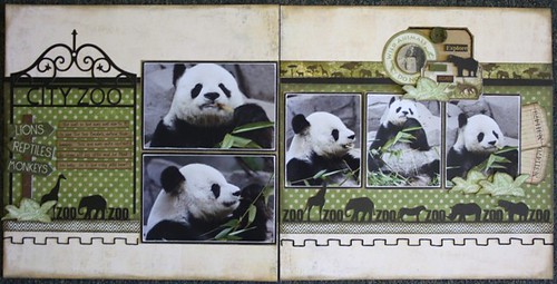
I am definitely a 2-page layout scrapbooker. That is not to say that I won't create single pages, I just prefer to make doubles. I like clean lines and good balance. The layout I created is a good reflection of my style.
I am trying to stay focused on creating pages for Jason's (my middle son) California trip album. This is the first in a series of layouts that I have to create for our trip to the San Diego Zoo. They have the most amazing Panda exhibit there and we felt as though we were right in the cage with this guy!
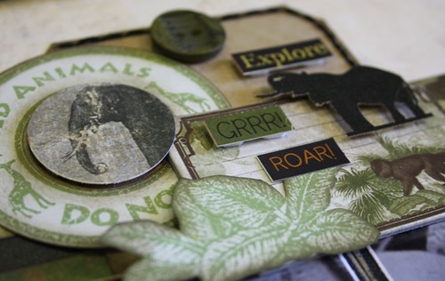
I kept the colours on my layout very neutral and focused on the black and green that was in the photos. I felt that this would really allow the photos to stand out and make a statement on my page. I incorporated stamps, die-cuts, stickers and this kraft tag to make an 'embellishment cluster' on page 2. I added some dimensional adhesive and some stitching to give my design depth.
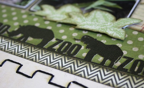
For the second part of the challenge I used my new Silhouette as the 'product or technique' that I find inspiring right now. I am truly addicted to my new machine and I rarely create something without using it. This border was cut using my new tool and it was perfect to tie together my page.
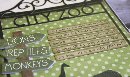
I also used it to make the 'City Zoo' sign on page 1 of my layout. It made the ideal spot for my journaling too.
I had a lot of fun working with Christa's challenge. I hope you enjoy visiting every month to see what the next challenge will be and what we all create on this journey. Be sure to visit the other ladies blogs by clicking on their names above or along the side bar of my blog.


Lovely layout, I would definitely recognize this as one of yours! Love the 'iron work'!
ReplyDeletelove all the detail, love the iron work..awesome!
ReplyDeleteCarolyn, this IS so you! Love the gate and the little cluster of embellies. Thanks so much for joining us on this journey!
ReplyDeleteThis is definitely a Carolyn Wolff layout - and I love how you're working that Silhouette, too. You found the perfect images to cut for this layout. Beautiful colour palette, too! Great job and I'm so glad you are part of the IE team!
ReplyDeleteOh my gosh..I have such envy that you can create such beautiful die cuts!! Fabulous job!
ReplyDeleteOh my gosh..I have such envy that you can create such beautiful die cuts!! Fabulous job!
ReplyDeleteLovely layout...I still have Zoo pictures to work on and your pages are so inspirational.!
ReplyDeleteWow! You make me want to go out and buy a Silhouette! Love your border, sign and cluster of embellies! Fabulous 2 pager!
ReplyDeleteThis is so you....another great double page full of gorgeous details.
ReplyDeleteGosh you make 2 pagers look so easy!!! I love the border you created with your machine!!! Beautiful page.
ReplyDeleteLovely double page layout...and your style is unique. I adore the border and all the fussy cutting.
ReplyDeleteFabulous page Carolyn! It has all your signature elements and goes so well with your photos :)
ReplyDeleteJoanne xo
Love the safari feel to this LO! The pictures are spectacular and love what you did with the Silhouette!
ReplyDeleteI need those zoo borders! Love the panda, he is so cute!
ReplyDeleteAdorable 2 paged layout especially the pandas!
ReplyDelete