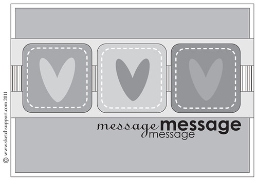
Here is the card sketch that the creative team at Sketch Support is working with this week. If you visit their website you can download a copy and play with it yourself.
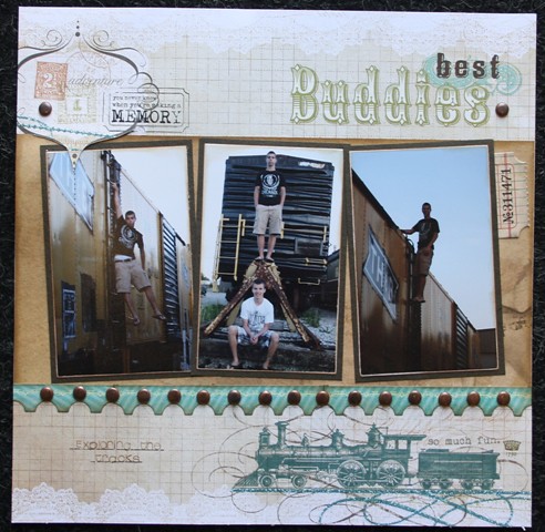
I created a one-page layout instead of making a card.
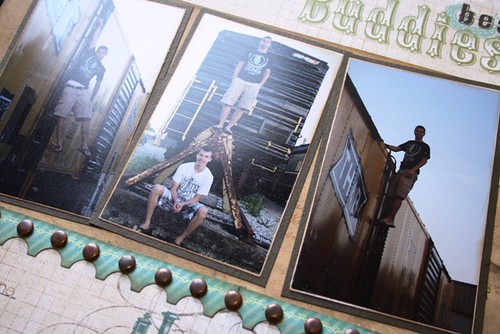
The three photos through the center of the layout take the place of the three squares showing in the sketch.
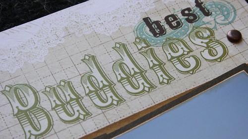
I dug deep into my stash and found the perfect rub-on for my page. The colours worked perfectly!
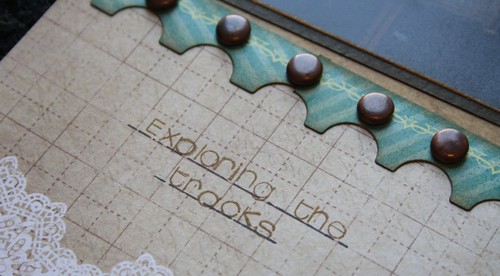
I cut apart a cardstock frame and created the border along the bottom and then added brads.
I also tried out a new stamp set for my journaling. That was a bit time consuming but I do like the font.
Cardstock – Bazzill
Pattern Papers – MME Lost & Found 2; Bo Bunny Et Cetera
Rubons – Kaisercraft; MME
Brads – Misc.
Ink- Ranger Distress Ink – Vintage Photo, Memento
Border – MME Cardstock Frame
Stamp – My Favourite Things
Ticket – Tim Holtz
Pen – Ultra Fine Sharpie


I love your layout. I find myself unable to wait to see what the DT is going to do in the layout area with the card sketch.
ReplyDeleteawesome layout! isn't it always a great feeling when you dig in your stash and finally use something??
ReplyDeleteGorgeous! I totally love it and a new found love of brads! They look perfect for this!
ReplyDeleteAwesome photos and it's amazing that this layout is based on a card sketch. Love it!
ReplyDeleteGreat layout! I love the colors and the feel of the papers you used!
ReplyDeleteJoanne xo
Great layout and off of a card sketch! You rock!
ReplyDelete