I decided that trying to design each and every page myself was really slowing me down. I headed to Pinterest for a little inspiration. While browsing around I found this layout! The artist of that fine design is Kinsey Wilson.
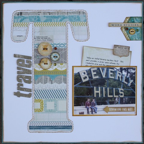
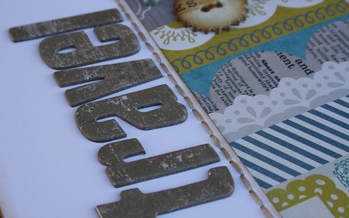
Here is my version of her layout. I used one of the newest collections in our store from My Mind's Eye........The Sweetest Thing - Bluebell! The large 'T' was what really drew me in. I created it using my Silhouette. I cut the letter out of my background and then placed a piece of pattern paper on the back to cover up the hole. Then I poked holes around the outside (on the white background) and hand-stitched around the letter. Brilliant, huh?
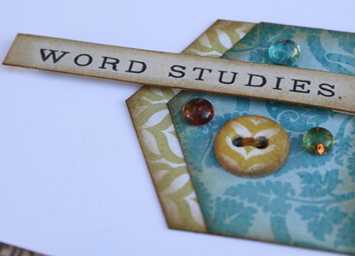
I cut this word right out of the pattern paper that I was using and used it as an embellishment. I added some Dew Drops for added interest.
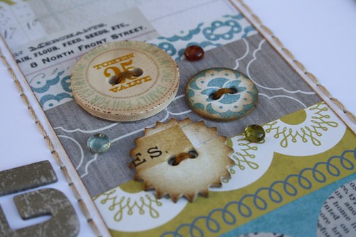
These buttons are part of the collection. I chose the patterns that worked best with my layout and then stitched them to my background. A few more Dew Drops tied it all together.
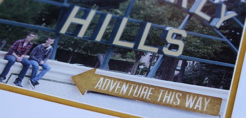
There are some awesome stickers that go with this collection and one of them happened to have the 'adventure' phrase on it.......everything about this trip was an adventure. I had to use it.
I added some chipboard letters to spell the word 'travel' and create my title.
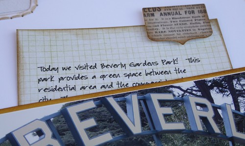
I placed my journaling behind my photo with a sticker for the tab to pull it up and down. I used my favourite font (Baby Boston) and printed it on one of the coordinating papers.
I have to say that it was really nice to 'borrow' and idea from someone and make it my own. I think I will try this again really soon.


Oh, the timing couldn't be better. I am making a scrapbook for my grandbaby's first year and this will be perfect for the first page. I checked it out on Pinterest and there was a K, which is what I will be using. I love the cut-out and the stitching. Thanks so very much...I love it!!!
ReplyDeleteLove this technique...Will definitely use it somehow! Great layout...
ReplyDeletelove you take on this layout, beautiful colors and your hidden journaling, brilliant
ReplyDeleteI LOVE this...so inspiring...I can think of a few layouts that can do with a large letter on it.
ReplyDeleteWonderful idea and using Pinterest as a jumping off point is great. This is Terrific with the large letter "T"!
ReplyDeleteWOW!!!!!!!!!!!!! Totally amazing!!!! What great details and the layout is fabulous! Don't ya just LOVE Pinterest.
ReplyDeleteThanks for playing along in the Sassy Cheryl's SMThursday this week.
Fun page! Congrats on your Sassy Cheryl win this week. Looking forward to your creation!
ReplyDelete