After last weeks break, we are back with the March Card Sketch on the Sketch Support blog. Can you believe that it is March?
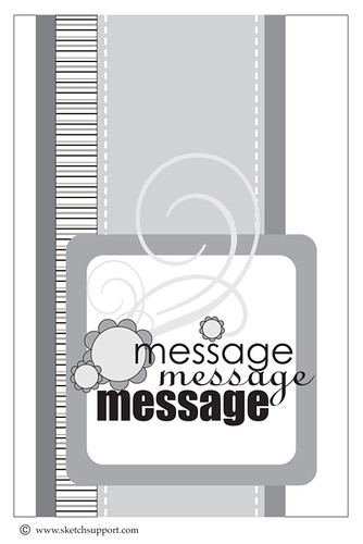
As you all know, I am not much of a card maker, so I decided to make this into a 2-page layout. Here is the sketch that I started with. You can download it on the Sketch Support blog.
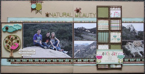
Using this sketch, I created my first layout using photos from my recent trip to California. These photos were taken on our second last day. We went hiking in the mountains in Malibu! It was a wonderful experience and I am so glad that I got to share it with Jason & David.
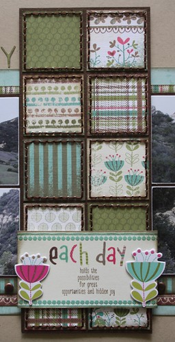
This is the part of the layout that resembles the sketch. I used a new collection from Little Yellow Bicycle called Paradise. I just love all the awesome papers that come in this line and this was a good way to get a little piece of each one. I stitched each square with brown floss (that took a little bit of time) and added some of the chipboard accents to the bottom to replace the message on the sketch.
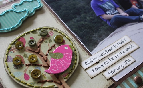
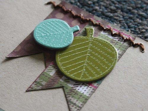
I also stitched through some of the chipboard elements. This is easier than you may think.
I created a little banner element at the top of my page and added a zig zag stitch along the top.
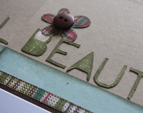
The title was hand cut from one of the papers. I included a couple of the flowers from the paper as well (that's okay, right? After all, I am a girl). I added a button to the center because my BFF believes that no layout is complete without a button or two.
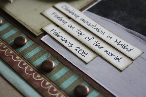
I kept the journaling 'short & sweet' on this page. There will be many more pages that follow this one that will tell the story of our day.
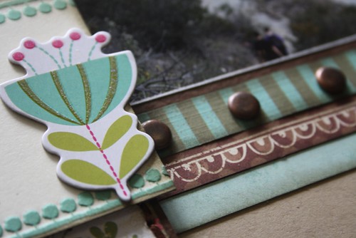
I dug into my stash of brads and added a few along the border strip. This is a great way to add some dimension to a page.
If you have some time, be sure to stop over to the Sketch Support blog and check out all the cards/creations using this card sketch.


I really like the colors in this layout. I will have to scraplift this for our trip to the Rockies.
ReplyDeleteI am not much of a comment person, but today I felt the need. I love all of your layouts. I wait each week to see what you do with each and every sketch and am amazed every single week.
ReplyDeleteI love how you used this sketch to make a two page layout. This is so perfect, I will probably have to lift it at some point for one of our hiking trips. Thanks for the inspiration.
Stunning!
ReplyDeleteWOW! This is beautiful Carolyn!! I love how you used the Card Sketch to do a double pager and the LYB products are awesome on this!! I used that same paper to hand cut a title on a layout that I have to wait til next Friday to show!! :)
ReplyDeleteYou hit it out of the park ... Again! I love this layout .... Pinning to my Carolyn Wolff board!
ReplyDeleteCarolyn - I agree with other posters. I can't wait to see what you do with the Sketches every month. I think you participated in the first online Sketch class with me in Fall 2010? I loved your class work then as well. I was the one who always converted everyting to 8.5x11!! Anyway, love your work, the colors you use, and the little details that bring every project home! Janelle
ReplyDeleteG-orgeous layout, Carolyn. Amazing photos and I love that stitching.
ReplyDeleteI had to chuckle at myself a bit...when I was first looking at the layout I thought, "I wonder who that girl is in the pictures." Then I realized it was you! I guess I had just assumed you'd be behind the camera.
I have already commented on your fb and on the sketch support blog. I adore your layout...everything about it. I love the layers, stitching and those awesome little squares.
ReplyDeleteA gorgeous layout....love your idea of using the card sketch to add to sketch #20!! Great colors, stitching, and brads on the lower border!! Another super layout!!
ReplyDeleteGreat layout - I love the look of the stitching throught the chipboard, and that you converted a card sketch into a double layout. Very cool!
ReplyDeleteLove how you turned the sketch to a double page layout!
ReplyDeletewhat a beautiful layout...oh my
ReplyDeleteYou are the stitching QUEEN...it is always the perfect addition to your designs. Those squares are perfect. WONDERFUL design. :o)
ReplyDeleteAnother fabulous layout Carolyn!
ReplyDeleteJoanne xo