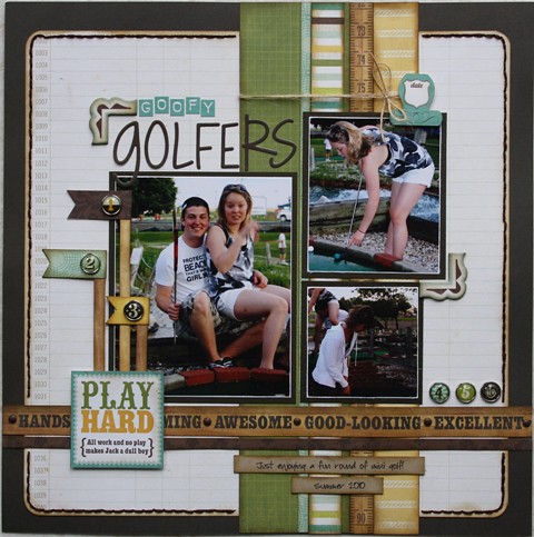
I still had a few photos left to scrapbook from a trip to the mini golf course so I thought I would do a 1-page layout to use them up.
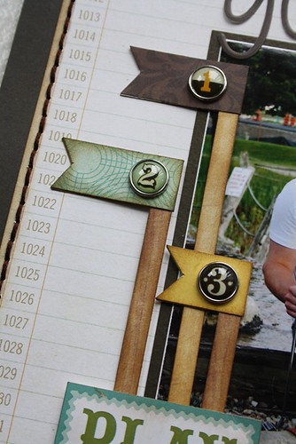
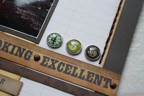
This layout was inspired by a sketch designed by Allison Davis for Sketch Support. It was an add-on sketch using flags. I created 3 flags made from papers and added the brads from the collection.
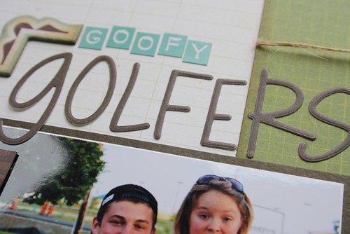
I used the small letters from the collection for the word 'goofy' and then I pulled in some larger letters from Bella Blvd for the word 'golfers'.
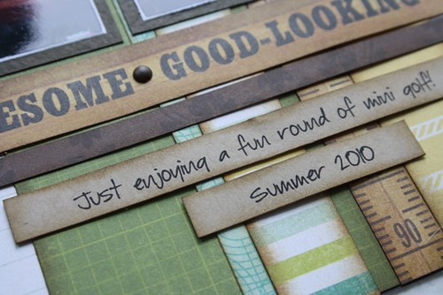
One of my favourite papers in this collection is the strips. It is an easy way to create a border. I used kraft cardstock and my favourite font (Baby Boston) for my journaling.
I added a stitched border and some smaller brads to one of the borders. I also inked all my papers with Distress ink to soften things up.
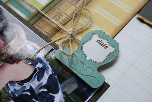
I added some twine around all the border strips and tied it into a bow near one of the sticker embellishments. Looking at this close-up photo, I realized I forgot to stamp the date on my layout.
I still have some of this paper left so I am sure you will be seeing another layout or two in the near future.


Love the layout and your flags are way cool!
ReplyDeleteI love how this collection works with your photos Carolyn and great job with the Flag Add On!! I like the border strips behind your photos and the awesome stitching!!
ReplyDeleteI love this layout Carolyn! The papers, elements and photos work together so well!
ReplyDeleteJoanne xo
Beautiful!
ReplyDeleteIncredible layout!! I love the colours, the brads and those flags are way cool. Thanks for the link to that free fonts site too!
ReplyDeleteoh my what an awesome layout...i love it....hugs
ReplyDeleteamazing layout!
ReplyDeleteAnother terrific layout!
ReplyDeleteVery cute!
ReplyDeleteAnother beautiful layout! Love the flags!
ReplyDeleteI love this line! Love your flag markers! Perfect for the golf course!
ReplyDeleteThis single page is dynamite! Great conceptualization and design!
ReplyDeleteI adore this collection and what you did with it.
ReplyDeleteI love your layout...you always have such an unique spin on a sketch. What font are you using for your journalling?
ReplyDelete