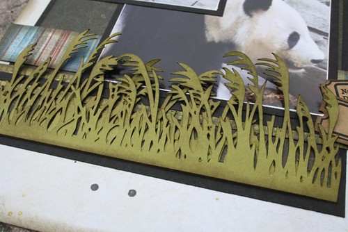
When I was creating the first layout (you can see it here), I found a file on the Silhouette online store for this grass. I thought it really resembled the bamboo so I downloaded it, but didn't end up using it. As it turns out, it worked perfectly on this page.
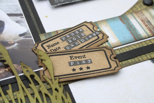
I added in some tickets from Maya Road and used some incredibly tiny stickers (I had to get out my tweezers) to add some journaling.
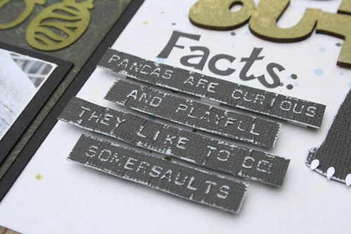
I wanted to include some fun facts about Panda bears so I pulled out my Dymo and Kraft Core cardstock and made my 'fact' strips.
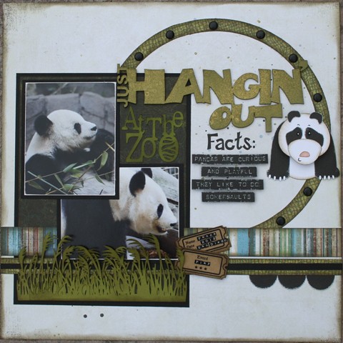
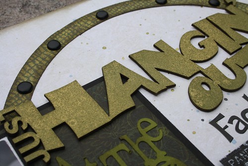
I used my Silhouette and created my own circle ring (pretty good huh?) and embellished it with black brads. I found this chipboard title and misted it with some Tattered Angels Glimmer Mist. I also misted the background with 3 different colours of mist. On my practice sheet I did a lot more splattering and I should have done that here too, but I was a chicken.....oh well, next time.
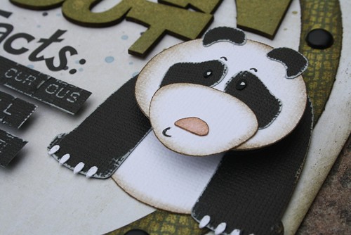
I just couldn't resist adding this sweet Panda from Silhouette. I added an Action Wobble to his head, so it interactive.
That is the last of my Panda photos. We really enjoyed visiting them at the zoo. I have discovered that there is a Panda Cam that you can watch and see what they are up to throughout the day. I visit it often. You can check it out here!


This is just about the cutest layout I have ever seen! LOVE IT!!
ReplyDeleteJoanne xo
Such a great layout!
ReplyDeleteIt DID turn out awesome!
ReplyDeleteYou ROCK!!!! Love the paper piecing panda.
ReplyDeleteGorgeous and a single too! That grass is really something, great page.
ReplyDeleteAwesome layout....love the panda and the neat grass! Thanks for the inspiration!
ReplyDelete