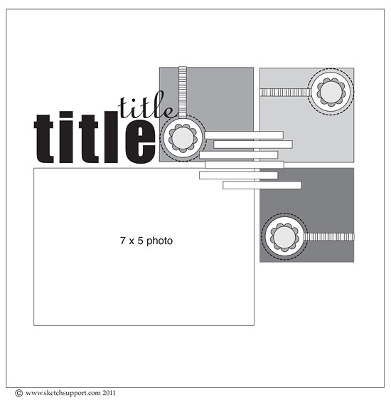
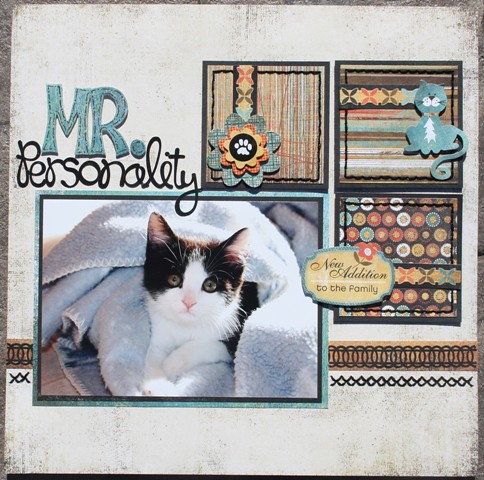
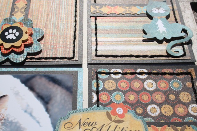
I pulled out the Max & Whiskers collection from Basic Grey and here is the layout that I created using this awesome sketch.
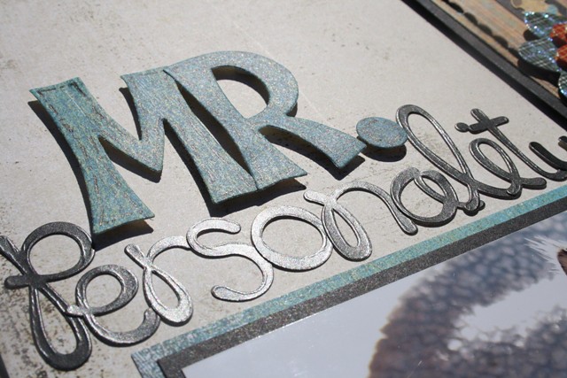
Last month I featured Cooper on the one-page sketch and somehow he made it on to this months layout too! In this photo he is much younger but still full of personality (that is where the title came from). I used a combination of die-cut letters and Doodlebug alpha stickers.
I used embellishments and stickers from the paper collection to make the squares and I added some stitching in black to outline them
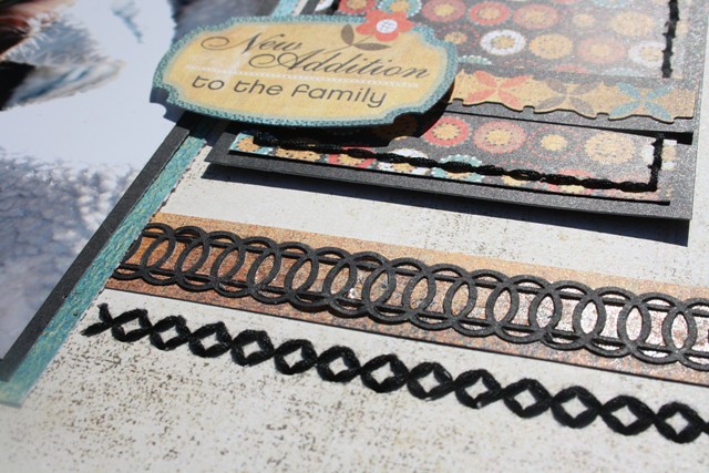
I added a border along the bottom of the sketch using a strip of paper and one of the lace doily borders that matches the collection. I also added a row of stitching and I used my Sew Easy tool to pierce the holes.
Be sure to visit the Sketch Support to get your copy of the sketch and see what the other members of the creative team have been up to.


Great title work and love the different stitching addditions Carolyn!
ReplyDeleteSuch a sweet layout!
ReplyDeleteAmazing, love the colors!
ReplyDeleteVery cute! I love the border punch!
ReplyDeleteGreat layout Carolyn...I love the stitching, doilies and embellishments you added.
ReplyDeleteGreat layout!
ReplyDeleteJoanne xo